2 May 2026 · Web Design · Business
What Makes a Website Feel Expensive?
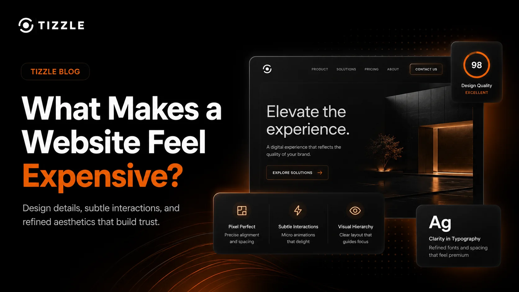
The design details, interactions, and visual decisions that make a website feel premium.
An expensive-looking website is not just a website with a black background, big text, and a few gradients.
It comes from restraint.
Good spacing. Clean typography. Sharp imagery. Smooth interactions. Clear hierarchy. Every small detail works together to make the business feel more trusted, more established, and more intentional.
That is what separates a basic website from one that feels premium.
It starts with spacing
Cheap-looking websites usually feel cramped.
Everything is too close together. Text blocks fight for attention. Buttons sit awkwardly. Sections have no rhythm.
Premium websites give content room to breathe.
Spacing makes a site feel calmer, clearer, and more confident. It tells the visitor that nothing has been rushed.
Good spacing helps people focus on what matters.
Typography does more than people think
Fonts change how a business feels.
A weak font can make a serious company look amateur. A strong type system can make even a simple page feel polished.
It is not just about picking a nice font.
It is about:
- headline size
- line height
- letter spacing
- contrast
- weight
- consistency
When typography is handled properly, the website feels more mature immediately.
Visual hierarchy guides the eye
A premium website does not make visitors work hard.
The most important message is obvious. The next step is clear. The page flows naturally.
Good hierarchy answers these questions quickly:
- what is this?
- why should I care?
- can I trust it?
- what should I do next?
If visitors have to search for the point, the design is not doing its job.
Interactions should feel subtle
Animations can improve a website, but only when they are controlled.
Overdone animations feel cheap. Random movement feels distracting. Slow transitions make the site feel heavy.
Good interactions are subtle.
A button responds properly. A card lifts slightly. A section fades in smoothly. The site feels alive without begging for attention.
That small level of polish makes a big difference.
Imagery matters
A premium website needs strong visuals.
That does not always mean expensive photography. It means visuals that match the brand and support the message.
Bad stock images, pixelated logos, random icons, and inconsistent graphics can ruin an otherwise decent website.
The visuals should feel deliberate.
They should make the company look more credible, not more generic.
Consistency builds trust
Premium design is consistent.
Buttons match. Cards follow the same rules. Spacing is repeated. Colours are controlled. Every page feels like it belongs to the same brand.
When a website is inconsistent, visitors may not consciously notice every issue, but they feel it.
The site starts to feel less trustworthy.
Built by TIZZLE
At TIZZLE, we focus on websites that feel intentional from the first click.
That means design is not just decoration. It is part of how a business earns trust, explains value, and turns visitors into enquiries.
A website does not need to be complicated to feel premium.
It needs to be clear, fast, consistent, and built with care.